Yearbook Vocabulary Crossword
This printable crossword puzzle has 34 clues. Answers range from 3 to 15 letters long. This crossword is also available to download as a Microsoft Word document or a PDF.
Description
Extra space around your page that is intentionally printed, then trimmed by the printer. The standard bleed size is 1/8 inch, and is usually used to allow for movement the paper during printing.
A line that gives credit to the author of a story. It can appear either at the beginning or end of copy
Photos that are captured without posing your subjects or distracting them from what they’re doing. They’re great for capturing everyday aspects of school life.
A page element that explains the who, what, when, where, and why of a photo. Captions can also be used in the yearbook to tell readers something they would not otherwise know when looking at a photograph.
The content of an article or news element. (Basically, it’s the words used to tell a story.)
• Work done to improve the format, style, and accuracy of a story. Though it can involve correcting grammar and spelling, the primary reason to edit a story
The element on a page that immediately attracts a reader’s attention.
The space between lines of text. You can adjust the leading of a text block to increase its readability or to squeeze more text onto a page. (Rule of thumb: The more space there is between lines of text, the easier that text is to read.)
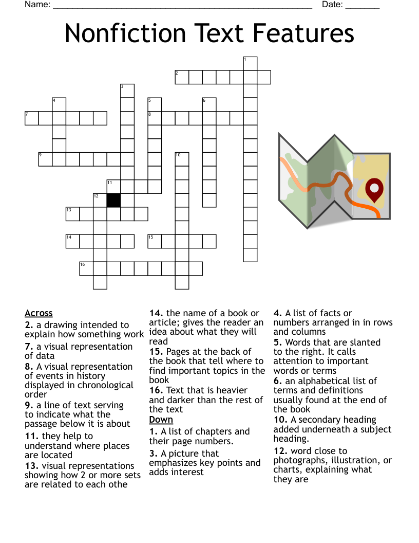
Also called a “mod,” is, essentially, the yearbook equivalent of a sidebar. It is a smaller amount of text with accompanying photos that supports a page’s main story.
The space between two letters that are next to one another. You can adjust the kerning to avoid gaps in your text (for example: if character pairs are spaced too far apart).
Posed photographs of individuals. These photos are the photos that are usually being referred to when someone is talking about their “yearbook photo” or “school portrait.”
• A copy of the yearbook’s final pages that are sent to the staff for a final review and approval.
Used to catch any typos before sending a yearbook to print. It’s the last read of the yearbook and should be done on a printed proof.
A phrase or quote pulled from a story and used as a graphic element. It highlights a key topic or point in a story and is usually placed in larger, more distinctive type.
A design treatment used to introduce copy. It is distinguishable by a large letter (usually capital) that appears at the beginning of a text block and has the depth of two or more lines of regular text.
• A page numbering that appears on the outside portion of pages, usually at the bottom. A folio may also contain the title of your yearbook or your section title.
The space between two facing pages (an important place to keep clear, because, when a yearbook is bound, the space between the pages shrinks). It’s best to apply a 1/2 inch margin to both sides of the gutter, or 1 inch in total.
A line (or lines) of large type used to introduce the most important fact to the reader.
A chart that represents the pages in a yearbook. It can be helpful when planning section placement and page content.
A layout is a design plan for a page or spread in a yearbook. It accounts for the size and position of all elements on a page.
The introductory portion of a news story; usually the first sentence or paragraph. It relays to the reader the most essential information. In traditional journalism, it is spelled “lede.”
Refers to two pages that face each other in a yearbook.
An idea or concept that’s used to tie together the various sections and stories found throughout the yearbook.
• A predesigned layout that helps maintain visual consistency throughout a book. Different sections may have different templates.
A color model traditionally used in printing. Printers use subtractive color, or CMYK, where cyan, magenta, yellow, and black inks are applied to paper. The color of the inks is altered by subtracting (or absorbing) light wavelengths.
• The abbreviation for dots per inch, it is a measurement of an image’s resolution. The higher the DPI of an image, the clearer and more detailed that image will print.
Fonts that have equal width for each letter. They can be serifed or sans serifed.
In yearbook publishing, it is also a word, part of a word, or a small line of text that falls at the end of a paragraph on a line by itself. These “hangers” (if you will) create unwanted white space and are distracting to readers.
A unit of measurement, often used to determine the width of an element on a yearbook page. It is equal to ⅙ inch (or 12 points).
The sharpness of an image. In print, resolution is measured in DPI. In digital, it is measured in pixels.
Is a guideline in photography that encourages a photographer to move the primary subject of the photograph away from the center.
Lack the decorative elements found on serif fonts. They’re great for digital projects, since they are easy to read on computer screens, but are also very popular for printed headlines.
• Have small decorative elements (called serifs) at the end of letter strokes. These fonts are more legible at smaller sizes and are great to use in large bodies of text, like the body copy in your yearbook.
A set of standards used to create consistency in your yearbook. Also known as a style sheet, it can be used for typographic, graphic design, and copywriting.